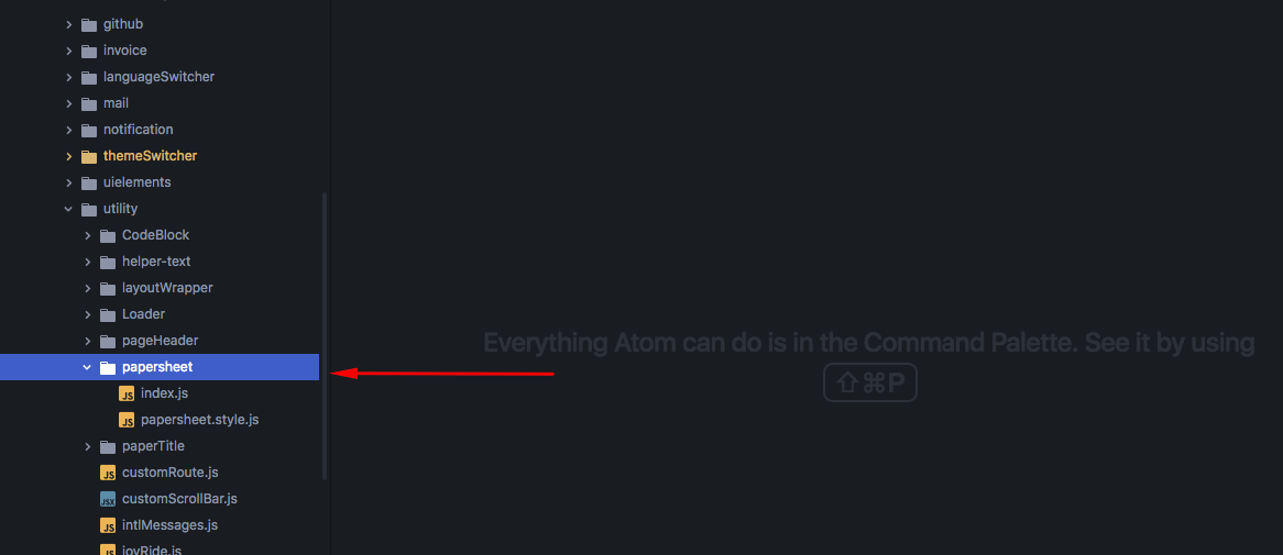
To add a paper and shadow like material component you need to add papersheet from 'components/utility/papersheet' folder. It add material feel in your component.
And the output box should be like this :

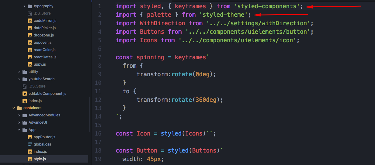
We have used styled component in our Isomorphic. Credit goes to the libraries like styled-components and styled-theme.
To add a stylesheet for your component you need to create a 'style.js' file and import 'styled' from 'styled-components' & import 'palette' from 'styled-theme'.
import styled from 'styled-components';
import { palette } from 'styled-theme';
Then add 'const' name for the div or existing component & write your css inside it. Then 'export' the const name and 'import' it in your component 'index.js' file and use it. For more information please check the styled components' documentation https://www.styled-components.com/docs .
How to change a Theme Color:
To change a theme color or add a new color for your site all you need to go to the 'settings/themes/themeDefault.js' file & add your color there. Remember 'palette' is a function and it's 1st parameter is the name of the color array and 2nd parameter is the index of the color array.
Here is an example of how you use 'palette' to add a color in your component.
import styled from 'styled-components';
import { palette } from 'styled-theme';
``const Button = styled.button```
color: ${palette('grey', 9)};
`export default Button;`


**To style an existing component -**


`import styled from 'styled-components';`

`import { palette } from 'styled-theme';`

`import MatButton from "material-ui/Button";`

``const Button = styled(MatButton)
color: ${palette('grey', 9)};
`;
export default Button;
```
To use it in your component -
import Button from "./style.js";
.
.
.
.
return(
<Button>Hello</Button>
)